A Design Guide to the Psychology of T-Shirt Colours and Branding for Business
The uniform you choose for your team, the promotional apparel you hand out at events, and even the colour of the mugs on your office desks are more than just functional items, they are wearable billboards. Every shade and hue communicates a subconscious message to your customers, instantly influencing their perception of your brand.
For businesses investing in custom clothing, customized t-shirts, mugs, and accessories, selecting the right colour scheme is not a matter of preference; it’s a strategic psychological move. This guide dives deep into the psychology of t-shirt colours for business and offers practical advice on choosing the best colour combinations for logo shirts that build trust, convey your values, and drive engagement.
The Subconscious Power of Colour: Why It Matters to Your Logo Shirt
Research shows that colour impacts consumer perception significantly. A study titled “Impact of Colour on Marketing” concluded that people make a subconscious judgment about a product within 90 seconds of initial viewing, and anywhere from 62% to 90% of that assessment is based on colour alone.
When a customer or client sees your employee wearing a logo shirt, that first impression is immediate. The t-shirt colours you choose trigger a deep psychological response, influencing feelings of trust, urgency, calm, or excitement long before a single word is exchanged.
The key to successful apparel branding is harmonising your existing logo colours with the background colour of the garment. For example, if your brand identity relies on stability, choosing navy blue or charcoal grey shirts as the foundation provides a trusted backdrop for the best colour combinations for logo shirts that highlight your unique selling proposition.
Decoding the Colour Palette: Psychology of Individual Hues
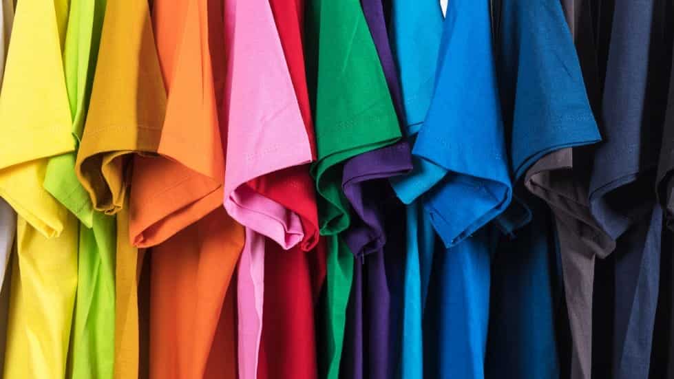
Understanding what each primary and secondary colour represents is the foundation of effective visual branding.
1. The Power Colours: Red, Black, and Blue
Red: Urgency, Passion, and Action
- Psychology: High energy, urgency, love, danger, and excitement. Red triggers the pituitary gland, raising heart rate and creating a sense of urgency.
- Best For: Food/Restaurant promotions, sales/clearance apparel, high-energy fitness brands, and products that require immediate consumer action.
- T-Shirt Application: Use as an accent colour or a garment base for short-term events. For example, a stark white logo on a red customized t-shirt demands attention.
Black: Sophistication, Authority, and Luxury
- Psychology: Power, elegance, mystery, and formality. Often associated with luxury goods and high-end services.
- Best For: Tech companies, luxury services, security firms, and apparel meant to project professionalism and quality.
- T-Shirt Application: Black is a universal choice for employee uniforms as it provides excellent contrast for almost any logo colour and instantly lends credibility.
Blue: Trust, Security, and Calm
- Psychology: Reliability, security, intelligence, and tranquility. Blue is one of the most popular t-shirt colours globally and is highly associated with authority (e.g., banks, tech giants, financial institutions).
- Best For: Finance, healthcare, technology, and any company seeking to establish long-term customer trust.
- T-Shirt Application: Navy or royal blue logo shirts are the default choice for uniforms and custom clothing where trust is paramount. Light blues work well for mugs and accessories to convey a lighter, friendlier tone.
2. The Creative & Optimistic T-Shirt Colours: Yellow, Orange, and Green
Yellow: Optimism, Clarity, and Warmth
- Psychology: Cheerfulness, mental clarity, and attention-grabbing. Yellow is the most visible colour in the spectrum.
- Best For: Travel brands, educational services, children’s products, and any product aiming to convey happiness or light.
- T-Shirt Application: Use yellow sparingly, perhaps for a subtle accent or a vibrant mug design, as an all-yellow shirt can be overwhelming.
Orange: Excitement, Friendliness, and Confidence
- Psychology: Energy, warmth, and high visibility without the aggression of red. It is often used to signal fun and creativity.
- Best For: Creative agencies, youth-focused brands, and brands that need to feel approachable and energetic.
- T-Shirt Application: Excellent as a contrast colour on the best colour combinations for logo shirts that use a neutral base like gray or navy.
Green: Health, Nature, and Wealth
- Psychology: Growth, sustainability, tranquility, and money. It is the easiest colour for the human eye to process.
- Best For: Environmental organizations, organic products, health and wellness brands, and financial services (when aiming for growth).
- T-Shirt Application: A subtle olive or deep forest green on a customized t-shirt projects earthiness and maturity.
3. The Balanced & Abstract Colours: White, Gray, and Purple
White: Purity, Simplicity, and Cleanliness
- Psychology: Clarity, safety, and neutrality. White provides perfect contrast and suggests hygiene.
- Best For: Healthcare, minimalist tech brands, and any professional service where cleanliness and precision are valued.
- T-Shirt Application: White customized t-shirts are the gold standard for high-quality printing, as they make the logo colour truly pop.
Gray: Neutrality, Balance, and Practicality
- Psychology: Timelessness, balance, and conservatism. It is the colour of compromise and functionality.
- Best For: Industrial companies, practical service providers, and apparel that needs to be versatile and hard-wearing.
- T-Shirt Application: Heather gray is an exceptionally popular and professional choice, offering a softer alternative to stark black or white.
Purple: Royalty, Creativity, and Wisdom
- Psychology: Associated with luxury, creativity, and problem-solving (due to its rarity in nature).
- Best For: Creative firms, high-end educational institutions, and luxury brands targeting a sophisticated, niche audience.
- T-Shirt Application: Best used on accessories like customized mugs or as a small accent on a logo shirt rather than the primary garment colour.
The Strategic Formula: Choosing the Best Colour Combinations for Logo Shirts
While the psychology of single colours is useful, successful branding relies on how colours interact. This is where strategic colour combination comes into play, utilizing the principle of figure-ground contrast.
Principle 1: Contrast for Readability (The 75% Rule)
For a logo shirt to be effective, the message must be immediately legible. The fundamental rule is high contrast:
- Dark Apparel: Use light, bright, or neon print colours (e.g., White, Yellow, Neon Green).
- Light Apparel: Use deep, dark print colours (e.g., Navy, Black, Deep Red).
Principle 2: The Two-Colour Combination (Branding Focus)
Most effective branding apparel uses a simple two-colour combination for maximum impact:
| Base Shirt Colour | Recommended Logo Colour(s) | Psychological Impact |
|---|---|---|
| Black (Authority) | Gold or Silver (Luxury) | Elite & High-Value: Projects premium pricing and exclusivity. |
| Navy Blue (Trust) | White or Light Gray (Clarity) | Professional & Reliable: Ideal for service staff and corporate environments. |
| Heather Gray (Neutral) | Black or Deep Red (Action) | Understated Power: Versatile for casual or promotional events, offering flexibility. |
Principle 3: Colour and Material Consistency
Ensure the perception of quality is consistent across all custom clothing, customized t-shirts, mugs, and accessories. The same hex code for a blue logo on a cotton t-shirt will appear slightly different on a ceramic mug or an embroidered hat.
- Actionable Step: When ordering custom products, always ask for a Pantone Match (PMS code) or a digital proof on the chosen material to ensure the perceived colour psychology remains consistent across all merchandise.
Advanced Application: Colour Psychology by Industry
The psychology of t-shirt colours for business must be contextual. What works for a tech startup will fail for a law firm.
Financial Services & Consulting (Trust & Stability)
- Primary Colours: Deep Navy Blue, Charcoal Gray, and Black.
- Logo Accent: White, Silver, or a reserved Gold.
- Why: These colours communicate seriousness, stability, and wealth, which are non-negotiable for fiduciary trust. Avoid high-energy colours like red or orange in primary uniforms.
- Example: A navy blue polo with a silver embroidered logo is one of the best colour combinations for logo shirts in the financial sector.
E-commerce & Retail (Urgency & Excitement)
- Primary Colours: Orange, Bright Blue, or Red (used as an accent).
- Logo Accent: White or high-contrast Black.
- Why: Retail often relies on impulse and immediate action. T-Shirt Colours like orange and red are scientifically proven to create urgency and draw the eye, making them excellent choices for promotional and sales staff apparel.
Food & Beverage (Appetite & Comfort)
- Primary Colours: Red (stimulates appetite), Yellow (energy), and Earth Tones (natural/organic).
- Logo Accent: White or Green.
- Why: Colour is crucial here. Red and yellow are famously used together to encourage eating. If the brand is healthy or organic, shifting the focus to green and brown tones instills trust in the ingredients.
Creative Agencies & Startups (Innovation & Freedom)
- Primary T-Shirt Colours: Purple, Teal, or highly contrasting, non-traditional palettes.
- Logo Accent: White or an inverse colour from the palette.
- Why: These industries aim to look different and innovative. They can leverage less traditional colours to signal creativity and a break from corporate norms.
Consistency Across the Custom Product Range
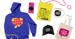
The effectiveness of the psychology of t-shirt colours for business extends beyond just apparel. Your customized mugs and accessories must maintain the same visual and psychological integrity.
For instance, if your brand identity is built on Blue (Trust) and White (Clarity):
- Custom T-Shirts: Navy blue base with a white logo.
- Custom Mugs: White ceramic base with a navy blue handle/rim and logo.
- Custom Lanyards: Navy blue webbing with white text.
This continuous reinforcement across all touchpoints ensures that every piece of merchandise contributes to a unified, professional brand narrative. This consistency makes it easier for customers to recall your brand, a key metric often referred to as brand salience.
Final Design Considerations
Before finalizing the best colour combinations for logo shirts, always review:
- Fabric Colour Consistency: Ensure the colour remains vibrant and true after washing (a major quality concern for custom apparel).
- Printing Method Impact: Screen printing and DTF inks appear differently. Darker inks on lighter shirts typically yield the most vibrant results.
- Contrast for Accessibility: Ensure the colour contrast meets modern accessibility standards, making your logo legible for everyone.
By moving beyond simple aesthetics and embracing the scientific and psychological power of colour, you transform your custom clothing and accessories into powerful, effective branding tools that communicate precisely what your business stands for.


